Modern real estate website design
The BrokerFold Team — Product + Engineering
Last reviewed
On this page
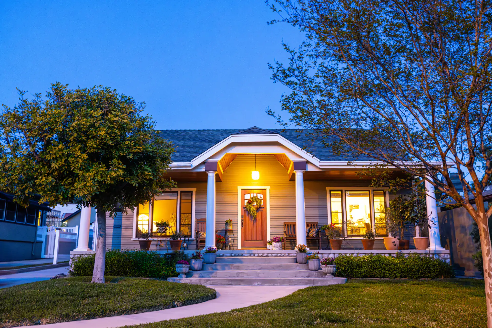
Modern real estate website design has quietly changed sides. A decade ago it meant decoration — sliders, gradients, a skyline hero. Today the modern register is the opposite: a fast, photography-led surface over live data, with typography doing the work ornament used to do. We design templates for working Canadian agents and rebuild them as the language moves, so this page is our working definition — what modern means now, what dates a site fastest, and where to see the current register running live.
Modern is a data posture before it is a look
The visitors judging your site arrive trained by the big portals. Their bar is not aesthetic; it is behavioural — search that responds instantly, statuses that are true today, photos that load before the thumb moves on. A site can wear this year’s fonts and still read as old if its inventory is thin or stale, which is why every serious design conversation starts underneath the surface. The design brief for a modern realtor site begins: current listings, fast pages, honest information hierarchy. Everything visual sits on top of that, a point our web design hub makes at length.
The current design language
Read fifty strong real estate sites and the shared grammar is consistent. Typography carries the brand: oversized display headings, confident scale contrast, prices set in tabular figures so columns align. Photography runs full-bleed and unretouched-looking — the property is the hero, never an illustration of one. Palettes have split into two families: warm, paper-toned grounds for approachable practices and near-black editorial grounds for the luxury tier — the dark branch has its own page at dark real estate design. Sections are fewer and deeper. Cards show their information plainly instead of hiding it behind hover states. And decoration has been replaced by restraint — the discipline covered in minimalist design, which is adjacent to modern but not identical to it.
What dates a site fastest
The aging happens in a predictable order. First, data: an out-of-date listing is the single most damaging element a realtor site can show. Second, the mobile experience: cramped filters and desktop layouts squeezed onto a phone mark a site’s era instantly. Third, the decorative tells — auto-playing carousels, award-badge rows, tiny serif body text, backgrounds behind every section. Fourth, and least urgent, the actual visual style. This ordering is useful because it is also a budget: fix freshness and mobile before spending a dollar on aesthetics, and much of the “dated” impression disappears on its own.
Modern behaviour, not just modern surfaces
A few behaviours now read as table stakes. Search lives near the top of the page and works on the first keystroke. Maps and lists are peers, not rivals — visitors flip between them. Galleries swipe cleanly. Saved searches and listing alerts exist because portal users expect them everywhere. None of this is visible in a screenshot, which is why modern design cannot be evaluated from a portfolio image. Browse live, on a phone, with your thumb — and run your current site through the website grader to see which half of modern, surface or behaviour, is actually your gap.
Where to see the register live
Our own answer to this brief is a portfolio of eight designed templates, each running as a browsable demo with clearly labelled sample listings — warm portals, data-forward layouts, editorial luxury, and a night-palette design among them. The template gallery exists precisely so “modern” stops being an adjective in a proposal and becomes something you can hold: open two or three demos, feel the pace of the pages, and notice how different the same modern grammar can look wearing different brands. That range is the honest conclusion here. Modern is not one style. It is current data, current speed, and a design language confident enough to let the properties speak.
Frequently asked questions
What dates a real estate website fastest?
Stale data first, then stock decoration: banner sliders, badge walls, tiny centred text over a generic skyline, and a design language borrowed from a 2015 brochure site. Visitors forgive plain design far longer than they forgive a listing marked active that sold last month.
Is modern design just a dark theme and big fonts?
No — those are surface moves. The core of modern real estate design is treating the site as a fast data product: current listings, honest photography, generous type, and pages that answer a visitor's question before asking for their email. A white, warm site built that way is modern; a dark site with stale data is not.
How do I modernize without rebuilding from scratch?
Separate the two problems. If your platform keeps data fresh and pages fast, a design refresh — type, palette, photography, section order — modernizes the site in place. If the platform is the dated part, no visual refresh fixes it, and the honest move is a replatform onto current machinery.
Keep reading
- Template gallery Eight complete websites, every one a browsable live demo.
- Dark real estate design When a black-ground realtor website works, when it backfires, and what a dark template must get right — with a live night design to study.
- Minimalist design Minimalist realtor website design that still sells: where restraint earns trust, where it starves a listings site, and how to tell the difference.
- Real estate web design The hub for realtor web design: what makes it different from ordinary web work, the template-to-custom spectrum, and how to judge any design you're offered.
- Realtor website grader A guided 10-dimension self-audit with a ranked fix list.