Dark real estate design
The BrokerFold Team — Product + Engineering
Last reviewed
On this page
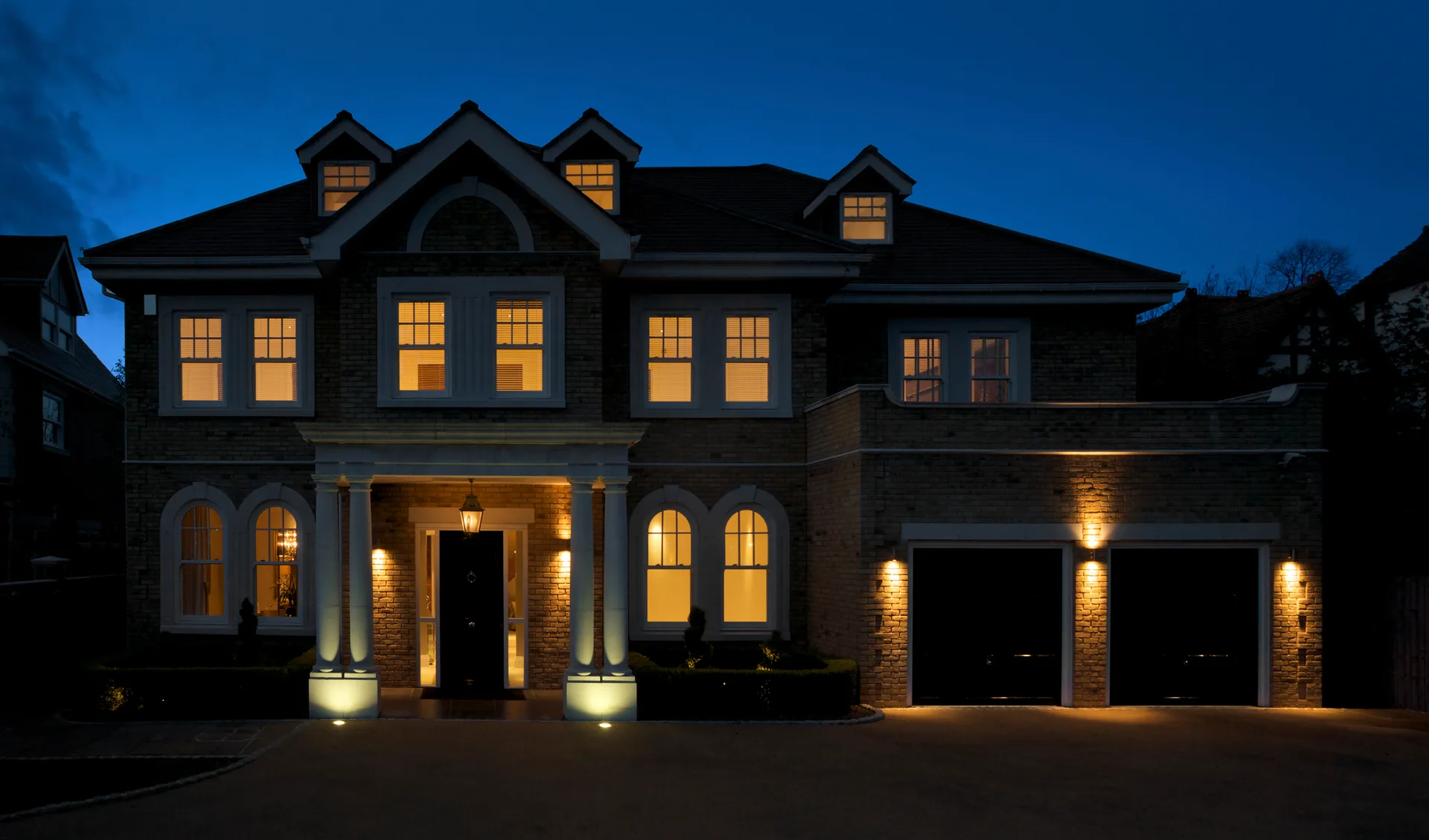
Dark real estate design is the highest-contrast choice an agent can make — in both senses. Done properly, a near-black site separates you from every white-and-blue portal lookalike in one glance and flatters property photography the way a gallery wall does. Done as an afterthought, it is the fastest way to make a site hard to read. We designed and maintain a night-palette template, so this page is a first-hand map of when dark works, when it backfires, and what to demand from any dark design you consider.
Why the dark ground flatters property photography
A photograph on a near-black surface behaves like a lit window: the frame recedes and the image projects. That is the entire visual argument for dark real estate design, and it is a strong one — twilight exteriors, interior shots with warm lamps, and city-skyline work all gain depth that a white ground flattens. The corollary cuts the other way: dark grounds expose weak photography without mercy. A practice running phone snapshots should fix the imagery before considering the palette, because the dark frame will present every flaw at gallery scale.
Where dark designs actually fail
Almost every failed dark site fails the same way: it was inverted, not designed. Someone flipped a light theme’s colours and shipped — and the listing cards lost their price contrast, the map arrived in daylight tones like a hole in the page, the form fields vanished into the ground, and thin grey text fell below comfortable reading contrast. A genuine dark template is drawn on the dark ground from the first sketch: every card, chip, gallery, and input has its own considered relationship to black. This is the single sharpest test in the category, and it takes five minutes in a live demo — go straight past the hero to the search results and the map.
Who the register suits
Dark is a brand decision before a taste decision. It suits urban and condo-centred practices whose photography leans to evening; luxury positioning, where the night register has become a tier signature — the fuller luxury context lives at luxury real estate agent websites and the template-buying angle at luxury templates; and bold personal brands that want to be remembered from a single visit. It suits family-suburban warmth less naturally — which is not a rule against it, just a reminder that the ground amplifies tone. If your brand voice is a porch light, a night palette will argue with it.
What we learned building Nocturne
Our own dark template, Nocturne, carries the register we think the category demands — “the city at nine in the evening” — and building it taught us where the craft actually lives. The accent colour has to survive on black without glowing radioactive. Prices need tabular, high-contrast figures because they are the most-read text on the site. Galleries want deeper blacks than the page ground so photos still project. And the sold-data and account surfaces must stay in-register, because a compliance gate that arrives in default white shatters the spell. You can browse Nocturne and the other designs in the template gallery — every demo runs labelled sample listings, so judge the dark ground where it counts: cards, map, gallery, form.
Deciding
Choose dark if your photography, market, and voice already lean there — and only from a template designed dark-first. Choose light without embarrassment otherwise; the broader current-register context is at modern real estate website design. Either way, the ground is the stage, not the performance. The properties still carry the show.
Frequently asked questions
Does a dark website hurt readability?
Only when it is built lazily. Light text on near-black needs deliberate contrast, slightly looser spacing, and restraint with thin type weights. A dark design drawn to those rules reads as comfortably as a light one — and the failures you have seen were inversions of light designs, not designs made for the dark ground.
Is a dark design only for luxury agents?
No — it is for brands the register fits: urban condo practices, evening-toned photography, bold personal brands that want instant separation from the white-and-blue portal look. Luxury adopted dark first, but the ground belongs to any practice whose imagery and voice suit it.
What should I check before choosing a dark template?
Open the demo at the surfaces that break first: listing cards, map view, photo galleries, and forms. If those were designed for the dark ground — legible prices, a map that matches the palette, inputs you can find — the template is real. If only the home page is dark, keep looking.
Keep reading
- Luxury templates How to choose a luxury real estate website template: the design tells that separate the tier, the data layer it still needs, and live examples.
- Luxury real estate agent websites The design grammar of luxury agent websites — editorial typography, restraint, dark palettes, video — and the data layer the surface still needs.
- Template gallery Eight complete websites, every one a browsable live demo.
- Modern real estate website design What modern actually looks like on a realtor site in 2026 — the design language, the surfaces that date fastest, and live examples to study.