Luxury real estate agent websites
The BrokerFold Team — Product + Engineering
Last reviewed
On this page
Luxury real estate websites fail in a specific, recognizable way: they decorate. Gold serif headlines, a stock chandelier, the word “exclusive” doing manual labour — luxury signalled rather than practised. Real luxury design is quieter and harder, and it follows a grammar you can learn. We have built luxury templates for working practices, including private commissions studied against the best international luxury sites, and the grammar below is what actually survives contact with a discerning clientele.
Restraint is the aesthetic
The defining move in luxury design is subtraction. One typeface family used with conviction. A palette of two or three tones — deep near-blacks or warm porcelains, with a single accent used sparingly enough to mean something. Whitespace treated as a material rather than a gap. Fewer sections, each given room. The test we apply to every luxury layout: remove one more element, and does the page get stronger? Luxury sites usually can; volume sites usually cannot. Restraint also has a practical payoff — it puts all the attention on the two things that carry the tier: photography and words.
Typography and imagery do the talking
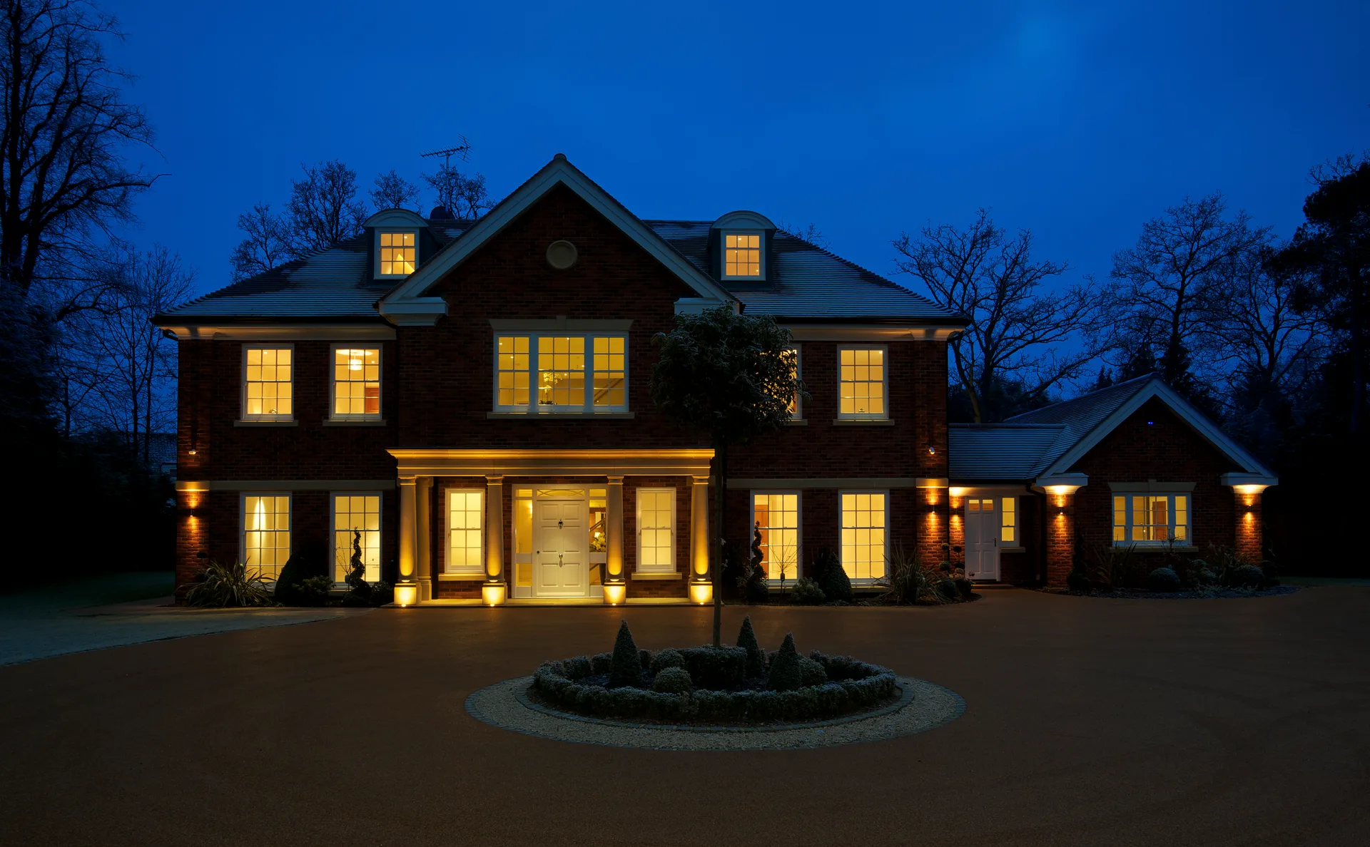
Editorial typography — oversized headlines, generous line spacing, confident scale contrast between display and body text — is the fastest register shift available. Pair it with imagery that earns the frame: full-bleed photography, twilight exteriors, and video heroes where genuine footage exists. The discipline point on video: a beautiful still outperforms mediocre motion. Nothing marks a site as aspirational-rather-than-actual faster than generic drone footage of a city the listings are not in.
Dark palettes, used with intent
The near-black ground with light type has become the tier’s signature for a reason: it flatters photography the way a gallery wall does, and it separates instantly from the white-and-blue portal register. It also demands craft — dark themes expose weak imagery, and every listing surface (cards, maps, galleries) has to be designed for the dark ground rather than inverted as an afterthought. Our template gallery includes dark editorial designs built this way from the start; the templates demos are the fastest way to feel the difference between a dark theme and a dark afterthought.
The layer decoration cannot replace
Here is what the beautiful-brochure school of luxury sites gets wrong: affluent clients are the most research-driven visitors in the market. They expect to search real inventory, study the history of a street, and look up what things actually sold for. A luxury site with no live listings behind its editorial surface is a lookbook — admired once, never returned to. The strongest luxury sites in Canada pair the register above with a full data plane: board-fresh listings, map search, and sold data served compliantly behind registration. The general anatomy is covered in real estate website examples; at this tier, the anatomy simply wears better clothes.
Getting there: template, custom, or both
The honest sequencing for a practice moving upmarket: start from a luxury-grade template executed with discipline — real photography, restrained palette, your own words — and let the brand mature before commissioning anything bespoke. The trade-offs are laid out in custom vs template; the shortcut version is that custom design amplifies an identity that already exists and cannot invent one. On BrokerFold, the editorial dark templates run the same data plane as every other design, so moving upmarket changes your register without costing you the machine underneath — which is precisely the combination the luxury tier’s visitors quietly check for. Restraint on the surface, depth underneath — that pairing, not the gold serif, is what luxury means on the web.
Frequently asked questions
Does a luxury site need custom design?
It needs luxury discipline, which is not the same purchase. The register — editorial type, restraint, superb imagery — can be executed on a well-built template system; what cannot be faked is the photography and the writing. Spend there first, and reserve custom design for a practice whose brand has outgrown every template's temperament.
Should a luxury website show prices?
For listed properties, yes — coyness reads as friction to a clientele that researches everything. The place discretion legitimately operates is off-market work: an exclusive-opportunities register behind a private conversation is a genuine luxury pattern; hiding public data is not.
Do luxury clients really check agent websites?
More thoroughly than any other segment. A luxury listing pitch is partly a marketing pitch — the seller is judging how you will present their home by how you present yourself. The website is your portfolio's first page, and it gets read before you arrive.
Keep reading
- Custom real estate website vs template The honest cost, time, and outcome trade-offs between a custom-built realtor site and a template — and the middle path most agents actually need.
- Real estate website examples An anatomy of real estate websites that convert: hero and search placement, listing cards, proof bands, area pages, and where the capture wall goes.
- Template gallery Eight complete websites, every one a browsable live demo.